
Seeing the Forest through the Trees
I ran into this graph last year and have been distriburting it to clients. It gives good perspective of down turns.
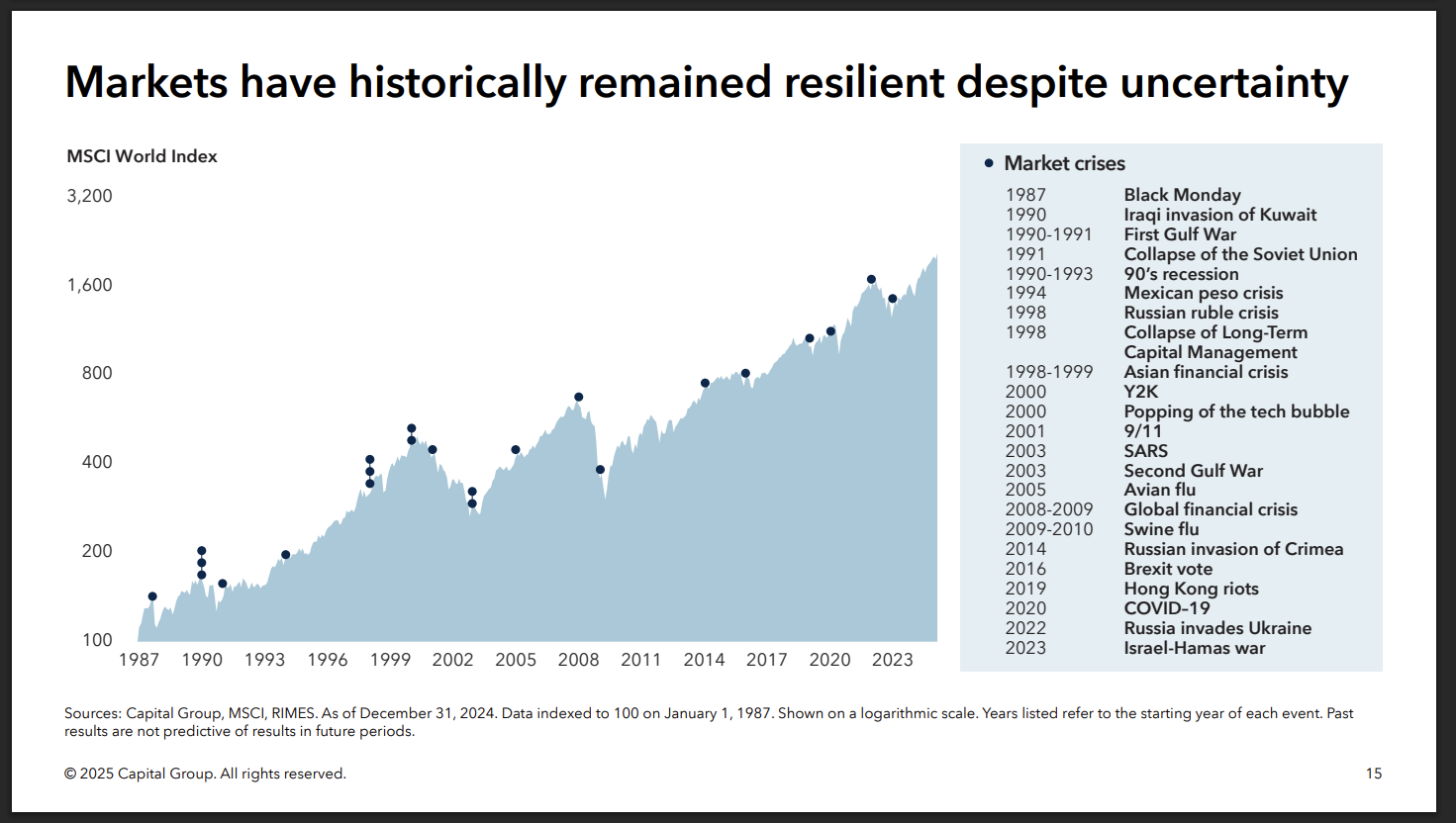
Although the above graph is short sighted since it doesn't cover the 1970s which was a bad decade for the market and post 1929, which was even worse. It is a good reference for the short term nature of historical corrections.
Its difficult to see your net worth drop dramatically during a correction but having a strong ability to be an independent thinker and continue investing when you feel pain from losing money has historically been a good way to build wealth.
Reflecting back on this chart during the next down turn will help clients see the bigger picture.